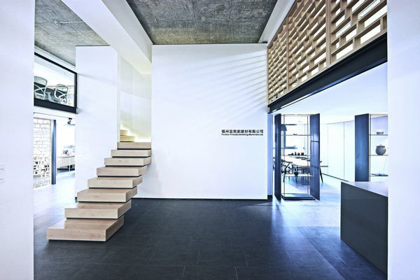
Introduction: People's imagination of office often begins from a warm reception desk and area. However, the office of Fuzhou Yimeijia grates people with white walls, grey tiles and stairs without handrail. This adventurous idea was from the creation of designer Lin Kaixin.
The main business of Fuzhou Yimeijia is trade of building materials, but the boss is often "absent-minded". He traveled around many countries and is a fancier of photography. He's only requirement for office design is elegant and quiet, which coincidence with Lin Kaixin, a design in pursuit of ""harmonious living aesthetics.
In order to create a clean, concise space with affinity, the designer applies traditional white wall and grey tile tone into the space, and matches with the warm wood color. In structure, the blurred division of funny combinations and traditional architecture scale is used, allowing viewers to experience the fun of space game.
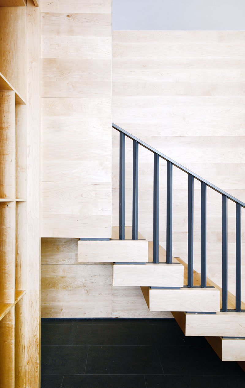
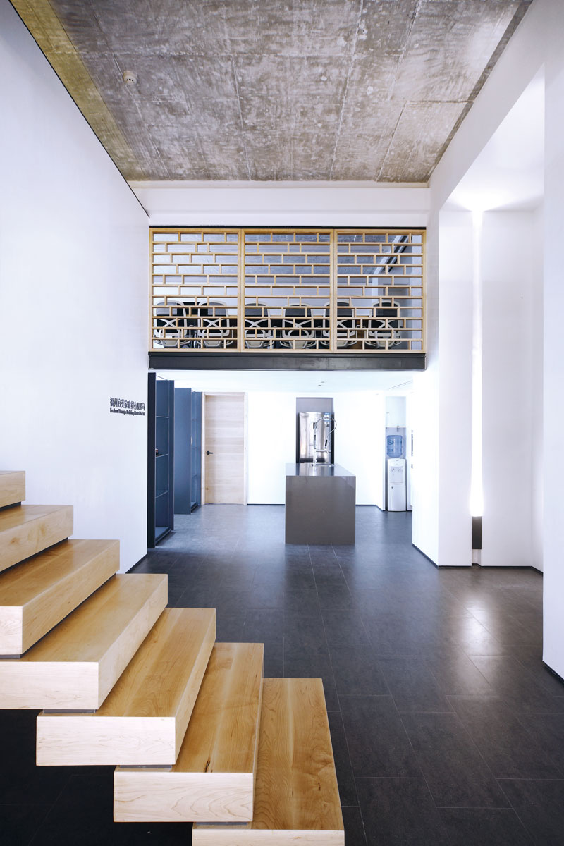
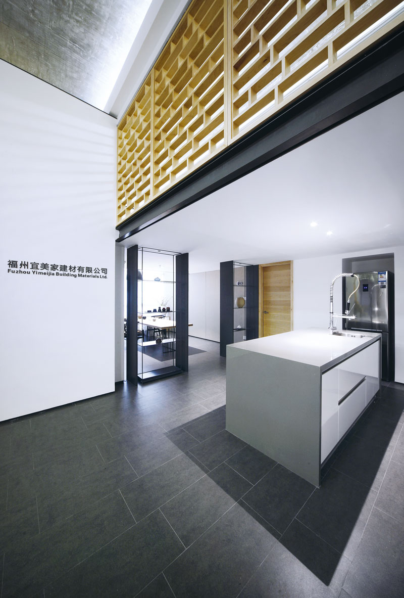
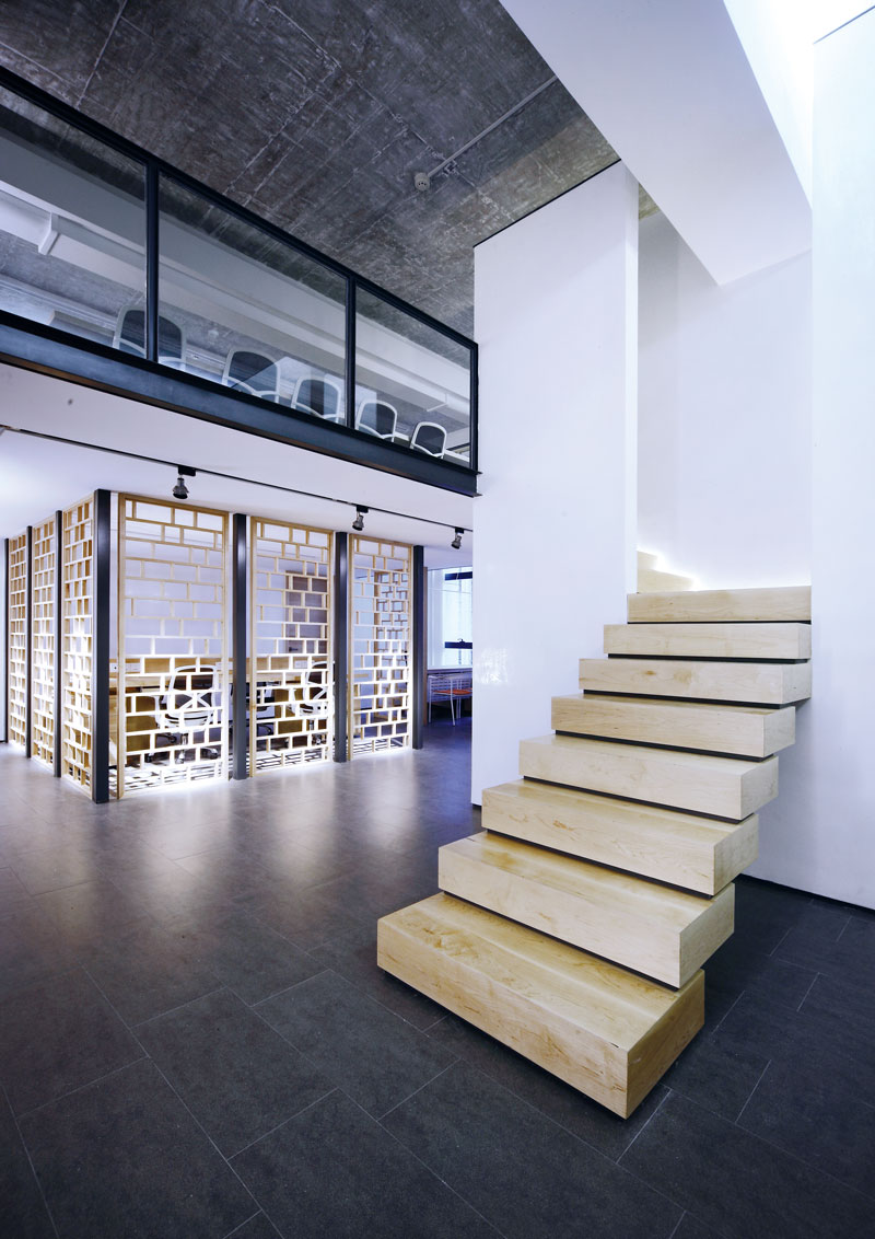
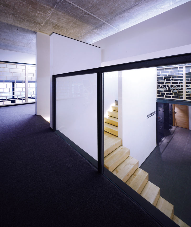
In the ceilinged entrance hall, grey antique bricks are used for the ground, the original white ceiling was shoveled away, exposing the original concrete. The way of sanding made the ceiling achieve the dustproof effect while has special and delicate texture. There are two white walls in the central foyer and a narrow staircase without handrail is in the middle. This seemingly risky design actually solved the obstruction hindering the movement of people to the attic caused by the roof beams. The staircase separates in the middle to both sides. In the middle of the tall white walls, it is like a gateway leading to elsewhere to attract the visitor of viewers. Through the dim light between the white walls and ceilings, we can see the walls do not really connect with the walls, and the edges are embedded with steel strips, highlighting the distinctive and upright body block shape. In order to improve the three-dimensional spatial sense, the hall has no lighting device, only the faint white light from the distant wall lamppost, allowing the view to relax in this serenity. The attic uses lattice pattern, a traditional cultural totem, in the way of bricking, enriching the expression of space. To ensure safety, the lattice grating has enough thickness. When the attic light is on, the light will be mapped on the walls through the thick grid, revealing modern and warm space temperament. It makes visitors recall the familiar old times: it is like the "thin strip of sky" in odd stones or the slanting sunlight shadow in ancient alleys, how time flies!
Despite the small size, the designer made full use of each space and rational planning lines to ensure every functional area to be effectively arranged. The first floor is the general manager's office, offices of persons in charge of building material brands, finance department, tea room and bar lounge area. One side of the attic is the store sales office area and the other side is the conference room.
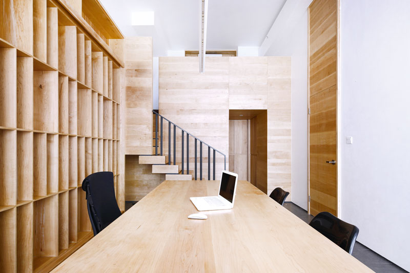
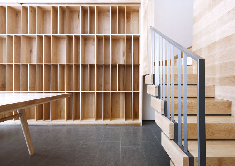
The bar in the right side is made of grey artificial stones, stylish, concise and cool. Opening the closet, there are coffee make, microwave and other kitchen utensils, meeting the needs of lunch, afternoon tea and small gatherings. The end of the right side is the office of general manager, an eyeful of wood color. The aisle of storage room is cave-like. Because of the small width, the designer used the way of body block cutting. The wood in the left is cut and moved out like a whole piece of wood. Visitors can reach the attic seating area via the start. This kind of isolated while linked space shows a solemn sense of field to a certain extent, while providing more experience scale to visitors. The extended plank on the door makes it a special landscape on the wall.
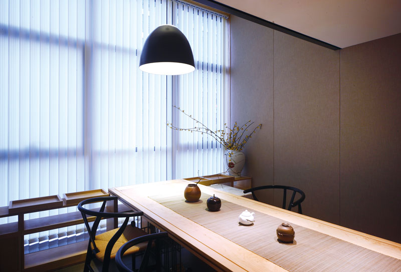
Both sides of the tearoom walls use linen material to create a natural atmosphere. The customized tea table feet are made of the blocks of find steel, light and modern, creating an illusion of suspension. In order to ensure unobstructed landscape view, the attic area does not extend to the junction with the glass, but has a reasonable distance with the glass. Look from the window, you can find another scene in this casual corner. By the wood lattice, you can vaguely see the conference room in the second floor. This kind of vague division is a false impression intentionally made by the designer. However, there is always light at the end of the tunnel, even the unconventional imagination, but life itself should always have surprises, why not?


차주헌
저작권자 ⓒ Deco Journal 무단전재 및 재배포 금지




0개의 댓글
댓글 정렬